Design strategies
Ideas to consider
Juxtapose opposites
Combine contrasting images to produce unexpected results
Be sure one concept dominates the other.
- Digital with traditional
- Saturated with unsaturated
- Color with black and white
- Blurred with sharply focused
- Minimal with complex
- Realistic with stylized
- Large with small
- Light with dark
- Plain with embellished
Frame elements
Surround elements to create an extremely strong focal point
- Natural enclosures (hole in a wall, doorway, mouth of cave, etc.)
- Vignette (negative space becomes frame)
- Border (literally or figuratively)
Simplify as much as possible
Strong designs are simple designs
- Posterize by reducing the number of values or colors
- Silhouette
- Reduce detail
- Crop
- Reduce the number of elements
- Abstract to simple geometric shapes
Combine elements
Group elements into stronger shapes or concepts
- Superimpose an image on an object
- Add a graphic element to a photo
- Blend one photo with another
- Group several images into a single unit
- Repeat an image (can be identical or slightly altered)
- Create a pattern
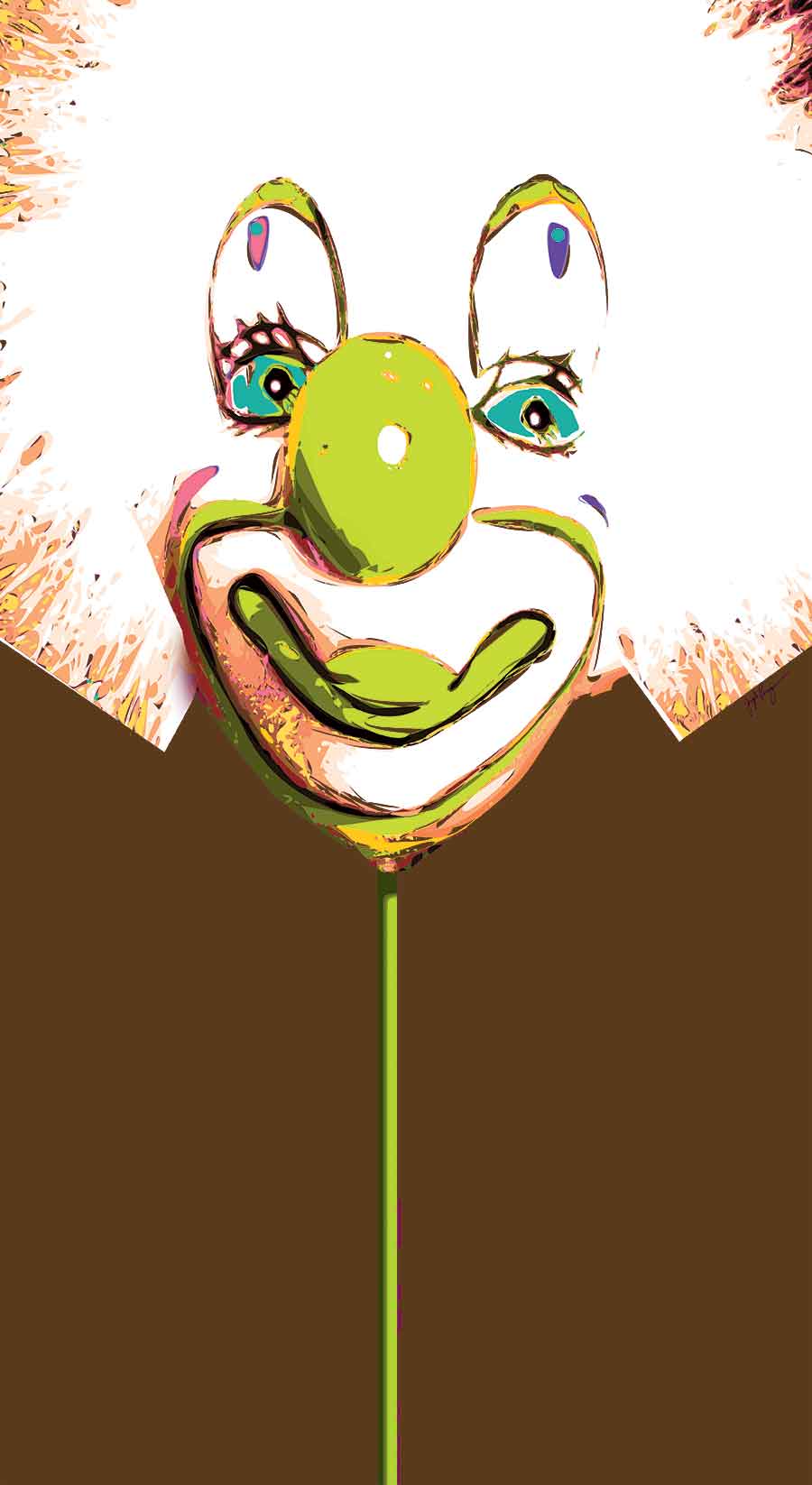
Fracture images
Break into more exciting pieces
- Mask with a graphic element
- Divide into sequential images (action sequence, parallel concepts, opposites)
- Cut into strips, then reassemble into a different order or discard some pieces)
- Create psychological discomfort with an odd orientation, unusual point of view, or unconventional layout)
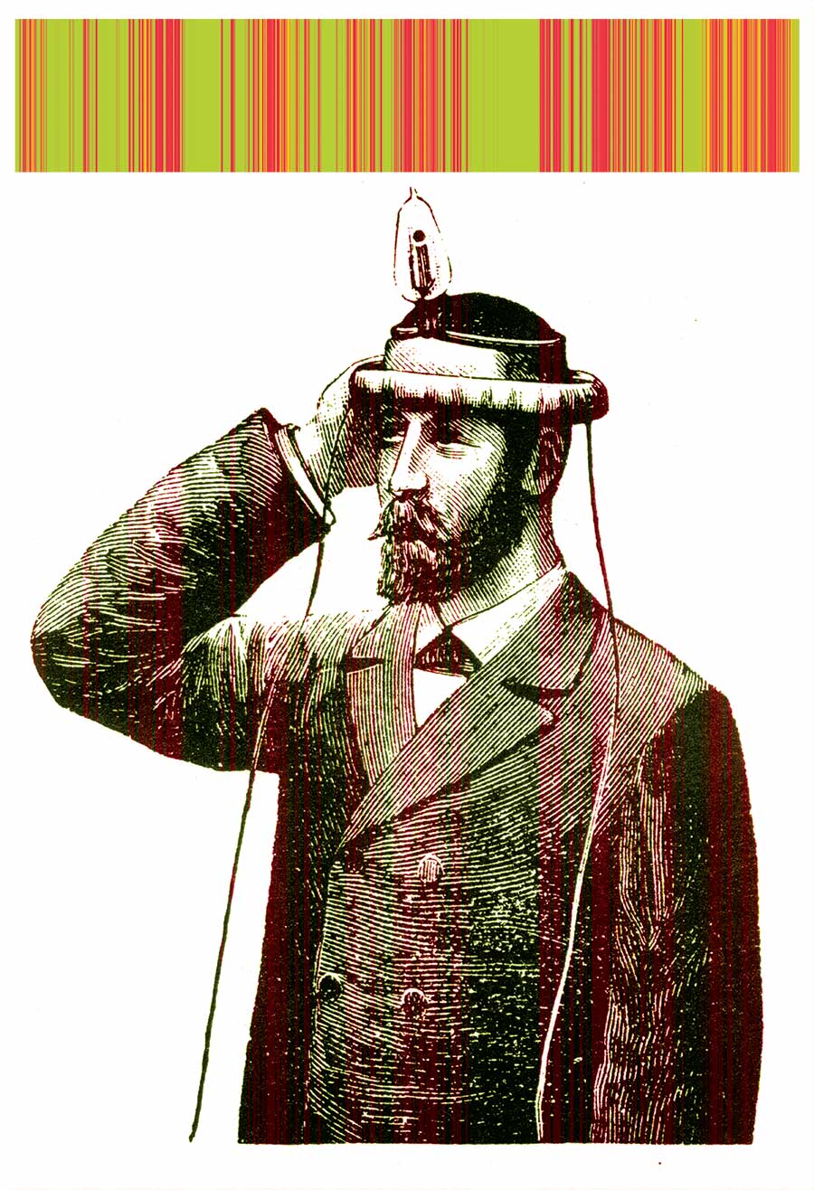
Unify images
Ways to make images seem like they belong together
- Recolor to similar colors
- Recolor to the same color
- Adjust saturation to the same level
- Adjust contrast to the same level
- Display on a common background
- Repeat a graphic symbol in each image
- Crop to a similar viewpoint
- Crop to the same eye level
- Make each center of interest the same size
- Apply the same special effect
- Mask each image with an unusual shape
- Put everything into a single shape


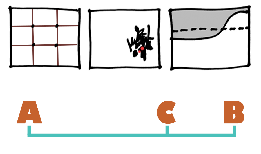
Classic division of space
The Golden Mean
It is hard to go wrong with this classic technique
- A centuries old approach to dividing space invented by the ancient Greeks
- It's sometimes called the Golden Ratio or the Eye of the Rectangle
- Most living things are proportioned this way (the size of an eye to the size of a head, the size of a finger joint to the size of the whole finger, etc.)
- Based on the ratio CB/AC = AC/AB, which is approximately 1 to 1.618
- Modern approach simplifies it to 1/3 to 2/3—often called the Rule of Thirds
- Relates to volume as well as length
Avoid the same old results
When you look at your pictures, do they all look alike? Do you want to move in a new direction, but don't know how? When I'm in this predicament I force myself out of my comfort zone by randomly choosing the design elements I will use to build my picture.
Arbitrary choices break old habits
There are several ways of accomplishing this. If you know how to program, it is fairly easy to write one that generates a random list of design element combinations. If programming isn't for you, simply write out a list of design elements by hand and roll dice to select one element from each category. Either way, build a composition based on the list. Most of the time your results will be distinctive and edgy, but sometimes, no matter what you try, the combinations just won't work for a given concept. Should this happen, create another list and try again.
You can also base compositions on abstract images. This is nothing new, but it is still an effective way of working. Source material can come from almost anywhere—abstract paintings, stains and rust, close-up photos, particle generator programs, photo effect filters, etc. The only requirements are strong composition and unrecognizable subject matter.For maximum benefit pick an abstract image that differs sharply from your typical work.
Exaggerate
Often what's obvious to us isn't to other people. We draw a tree and think that it's vastly different from the one we drew in our last picture, but our viewers don't see it that way. If we want something to be unique, we need to study its characteristics and determine which are most distinctive, then emphasize them through exaggeration. Push the exaggeration to extremes (just how far varies depending on how realistic you work) to be sure your viewers get the message.
Do the opposite
Flipping an idea on its ear is another good way of seeing things differently. It's a simple, but powerful technique—develop a new design by reversing some or all of your dominant design elements. If it's a night scene, make it a day scene. If your center of interest is small, make it huge. Challenge yourself to communicate the exact same idea in a completely different visual way. It doesn't always work, but the results are impressive when it does.
You can try this technique at any point in the design process—in the beginning while you are searching for a direction, in the middle when you are evaluating ideas, or at the end after you have a design you really like. I know it's tempting, especially for students, to settle for the first good idea that comes along, but I encourage you to resist this and open your mind to more creative solutions.