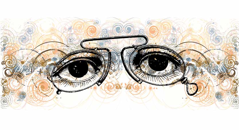
Looking deeper
Structured critiques
Early in the planning stage of this website, I had to decide what type of content to include. I hoped there might be something interesting among the visual aids I've created over the last 10 years of teaching, so I looked them over, and of all the things I found, this is the one I most want to share. It is a worksheet for critique sessions. It has a twofold purpose—to give structure and focus to image analysis and to aid in planning and design.
Vague analysis isn't helpful
When I started teaching, my critiques were like the ones I participated in as a student. They were free-flowing with comments that were vague or "artsy". People would say that something was cool, or that it was cutting edge, or that it didn't work. The problem with these types of comments, even when they are completely accurate, is that they aren't particularly useful. This type of criticism isn't specific enough for people to understand how to repeat the good things they're doing or fix the things they are doing wrong.
To do that critiques need to focus on the basic design elements and how they can be used (see design better pictures). My analysis sheet does this and more—it maps these technical ideas to the message the artist wanted to convey. Since adopting this worksheet, I find students communicate more effectively through their work and build skills faster because they have a better understanding of their strengths and weaknesses in practical, everyday terms. It is something that they can take back to their desks and use to plan their next project or to evaluate its progress relative to what they are trying to accomplish.